
Exhibit Review: ‘metanoia’ at FAB Gallery
Modern and relevant, 'metanoia' bridges together art and innovation through contemporary designs and inventive concepts.
 Natalia Gala
Reimagined book covers, wooden sculptures, and meticulous brand redesigns are just a few of the creations designed by the University of Alberta’s Bachelor of Design class of 2024.
In metanoia, displayed at FAB Gallery, styles are minimalist, maximalist, and everything in between. The designs are tactful and uncluttered. They’re user-friendly and legible, proving that it’s possible to create aesthetic, refined designs of everyday objects.
Many of the creations showcased in metanoia blur the lines between art and utility. One example is Basknet, designed by Dree Beaudry. This is a versatile invention with multiple uses. Hung underneath a shelf, Basknet can hold everyday objects while also being used as a hanger. Made out of rubber, ceramic and metal, it’s designed to seemingly flow and follow gravity like a produce bag. This illusion, coupled with its durability, makes it as convenient as it is charming.
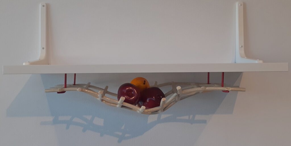
Beaudry’s design would fit perfectly into an organic Earth-inspired or rustic kitchen setting. Its neutral color and relaxed, edge-free shape allows it to harmonize with and complement its surroundings rather than impose on them.
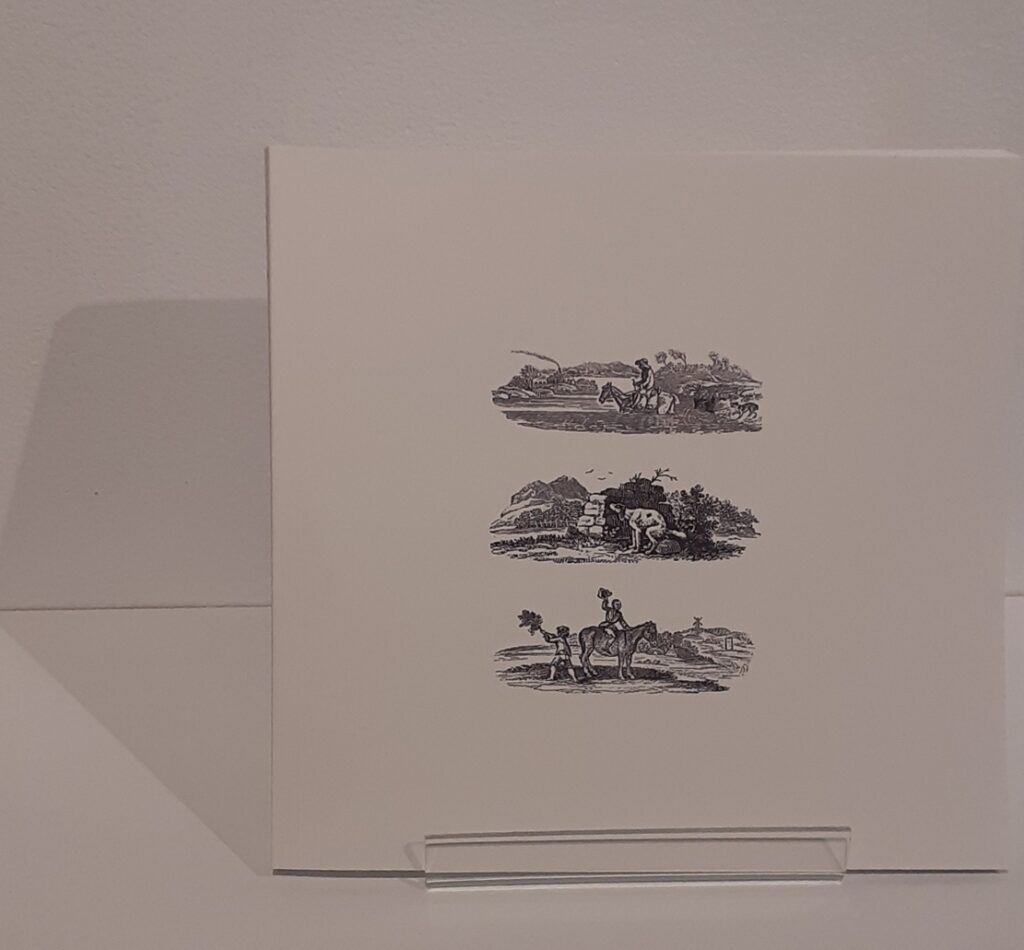
Much like Beaudry, Autumn Sanders also chose to embrace simplicity. Her redesign of Thomas Bewick’s book, “A General History of Quadrupeds” (1970) is elegant yet practical. Unafraid of leaving an abundance of blank space, she formulates the book so that it’s both visually pleasing and navigable.
There is no title to be found on the front page. This unusual design step foreshadows the abundance of illustrations within the book itself, and also stimulates the reader’s curiosity.
Meanwhile, Yiwen Xu redesigned the covers of the 1981 book series “Totto-Chan” by Tetsuko Kuroyanagi. The nostalgic illustrations are reminiscent of children’s drawings, which is fitting since the series is aimed toward a young audience.
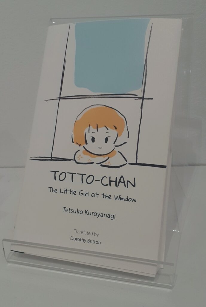
The girl portrayed on Xu’s cover of “Totto-Chan: The Little Girl at the Window” consists mostly of lines, and is sparsely coloured. Splotches of pale blue, pink, and yellow incompletely fill the uneven shapes. There is nothing intimidating about this design — it immediately struck me as friendly and endearing. The informal font, together with the imperfect line angles, promotes an atmosphere of creativity and determination. Moreover, I perceived it as a call to embrace individuality through imperfection. Purposeful imperfection is precisely that which makes Xu’s art believable.
In contrast to Sanders and Xu, Sydney Boyce-Fontaine and Andrea Klapstein reject minimalism for peppy colours and unrestrained vibrancy. In their branding redesign of the Edmonton-based kombucha company, Boocha, their designs are reminiscent of lively comic books or street art. The goal was clearly to make the branding stand out and appeal to those looking for something new or different.
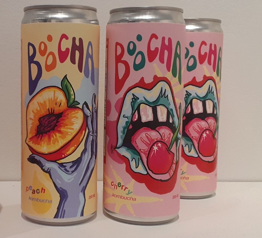
Again, the font is significant; in this case, it is informal and wild. It sends the message that Boocha wants to appear quintessentially unrestricted and daring. In so doing, it means to break away from the boring and the mundane. The apparent brightness and freshness of the design is further reinforced by illustrations of fruit, which immediately attach sweetness to the product.
Boyce-Fontaine is also the designer of Styled for A Better Word, a digital tool meant to teach users about sustainable fashion choices. Its design is reminiscent of a magazine montage and is refreshingly retro.
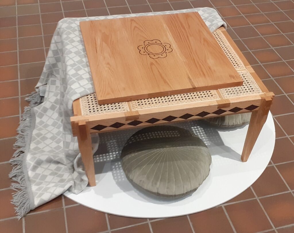
Meanwhile, Adrielle Aquino’s Araw’t Gabi mixes Japanese and Filipino design elements. I found that the combination of earthly colours and soft fabric with red oak and rattan made for a tranquil, serene seating area.
Many other designs, including website portals, watches, games and more, are also featured in the exhibit. The exhibit is absolutely jam-packed and takes up every inch of the gallery. metanoia highlights the achievements and the vast potential of the next generation of designers, well beyond the few highlighted here.
The only unifying element which serves to define metanoia as a whole is an abundance of highly polished modernity and nowness, even in its most retro designs. This modernity is caught in a state of balance between the present and the future.
The name metanoia refers to a transformation. Seeing the ultimate result of the Bachelor of Design class of 2024’s graduation work is the equivalent of seeing the outcome of their evolution after years of study.
You can explore metanoia at FAB Gallery until April 6.


